Challenge:
Design a Mobile app for people who don’t even have the time to visit a restaurant. The challenge was to find a way for these individuals to order and receive food at their own convenience.
Design Process:
we decided to use the Agile UX Design framework for this project. By letting the validation of hypotheses guide my work, we could ensure that I was creating a product that truly meets the needs of people (user-centered design ).

The Goal
Our goal was to design a mobile app that lets users quickly and easily order from Yummies— a hypothetical restaurant.We should decide to start implementing the project codes; if the test result was positive for more than 75% of participants. If the success rate was between 50% and 75%, we should go back to the design cycle and upgrade the design, and if the success rate was below 50%, we must re-idea to achieve new design examples.
My Role
User Experience Designer responsible for the app’s design from concept to delivery, Implementing PWA design concepts in mobile and web app.
Understanding Users
As a UX designer, my job is to learn as much as I can about the users to design a valuable product that meets the users’ real needs. One way to understand the requirements and motivations of the End-user is to hear directly from them. So, I interviewed eight (8) persons aged 20 and 60 years who understand ordering food online.
I asked following questions
- Have you ever used and how often do you use online food delivery services?
- What deliver apps you usually use? why and why not?
- What’s challenge you encounter while using delivery app?
- when and where do you usually use food delivery?
- Can you talk me through the process you order food delivery online?
- What are the things you care most when you try to order food online? can you prioritize them?
The result of study
- 7 out of the 8 participants said they are most likely to use a food ordering platform when they need a quick way to quench their hunger.
- 7 out of 8 participants said they do not like platforms that are difficult to use.
- 4 out of 8 participants preferred to pay for their food after delivery.
- One participant, who is not fluent in English, said they dislike text-heavy apps.
- 1 out of 8 participants doesn’t like using the application because of the application’s accessibility issues. (consider people whit disability)
Why was this carried out:
- Create deep empathy for our application and creating personas.
- Understand their pain points, mental modes, true needs and priorities.
- To find any possible assumptions as much as possible.
User Personas
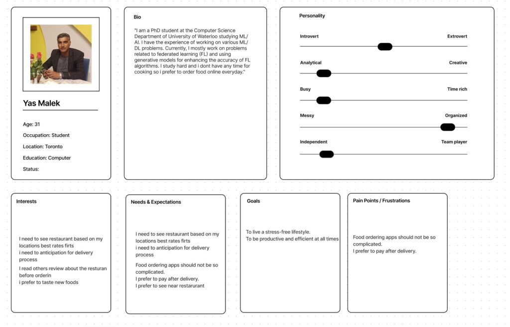
Based on the report from the foundational study, I created a persona whose demographics, motivations, goals, and frustrations express the users’ requirements.
User Story

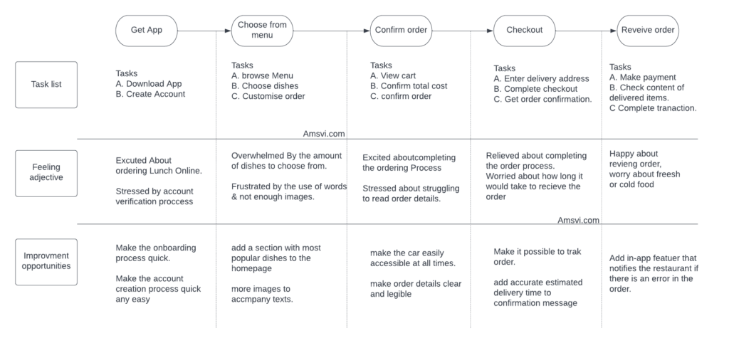
purpose of user story is to articulate how a software feature will provide value to the customer, we used the following framework to unlock knowledge about end user:
User Journey Map
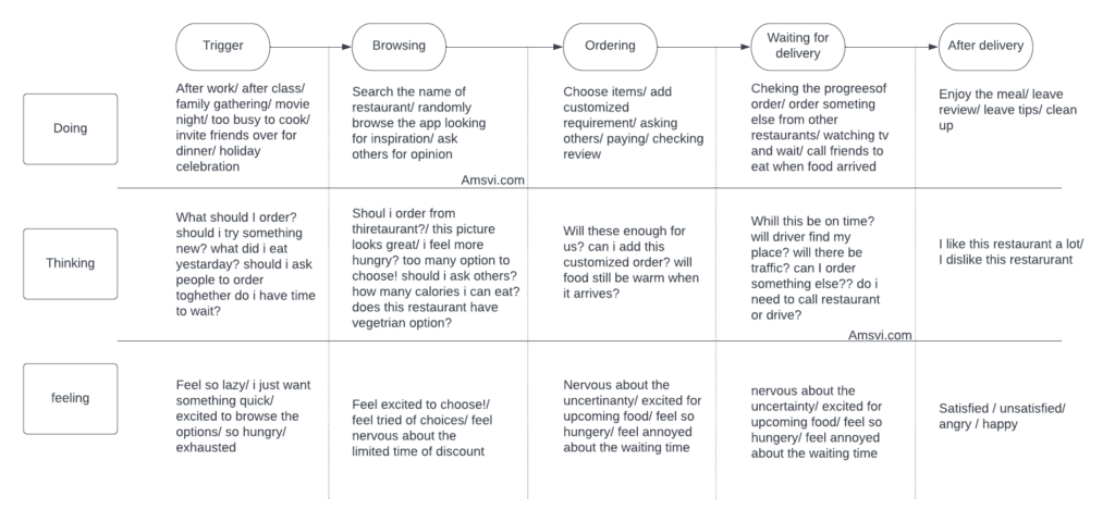
User journeys build off the personas, and user stories. Because user journeys can be very intricate, we create maps to organize the steps and outcomes from various journeys that users could take.
Competitive Analysis
I checked out some popular food delivery apps. I interacted with the platforms and read their customer reviews. It helped me recognize some weaknesses in the current solutions and opportunities for forming a better user experience.
User Flow
To create an intuitive design, I mapped a user flow that prioritized recognition over recall. I did this by creating a path that is familiar to the users.

wireframe
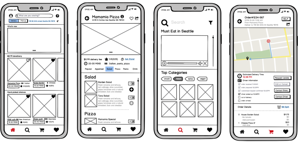
When the user flow mapped out, I then proceeded to wireframes. Several iterations of each screen were drafted on Balzamic to ensure that the elements that made it effectively addressed the user pain points.
I prioritized ease of use and a quick ordering process for the all-screen to make the experience quick and stress-free.
Usability Study (Round 1)
To get insight into the app’s usability, we bring 4 participants to test the low-fidelity prototype. By observing the participants interact with the app and hearing their thoughts using the think-aloud method, I identified problem areas in the app’s design. We noted the results and used an affinity diagram to identify patterns.

Hi-fi clickable prototype
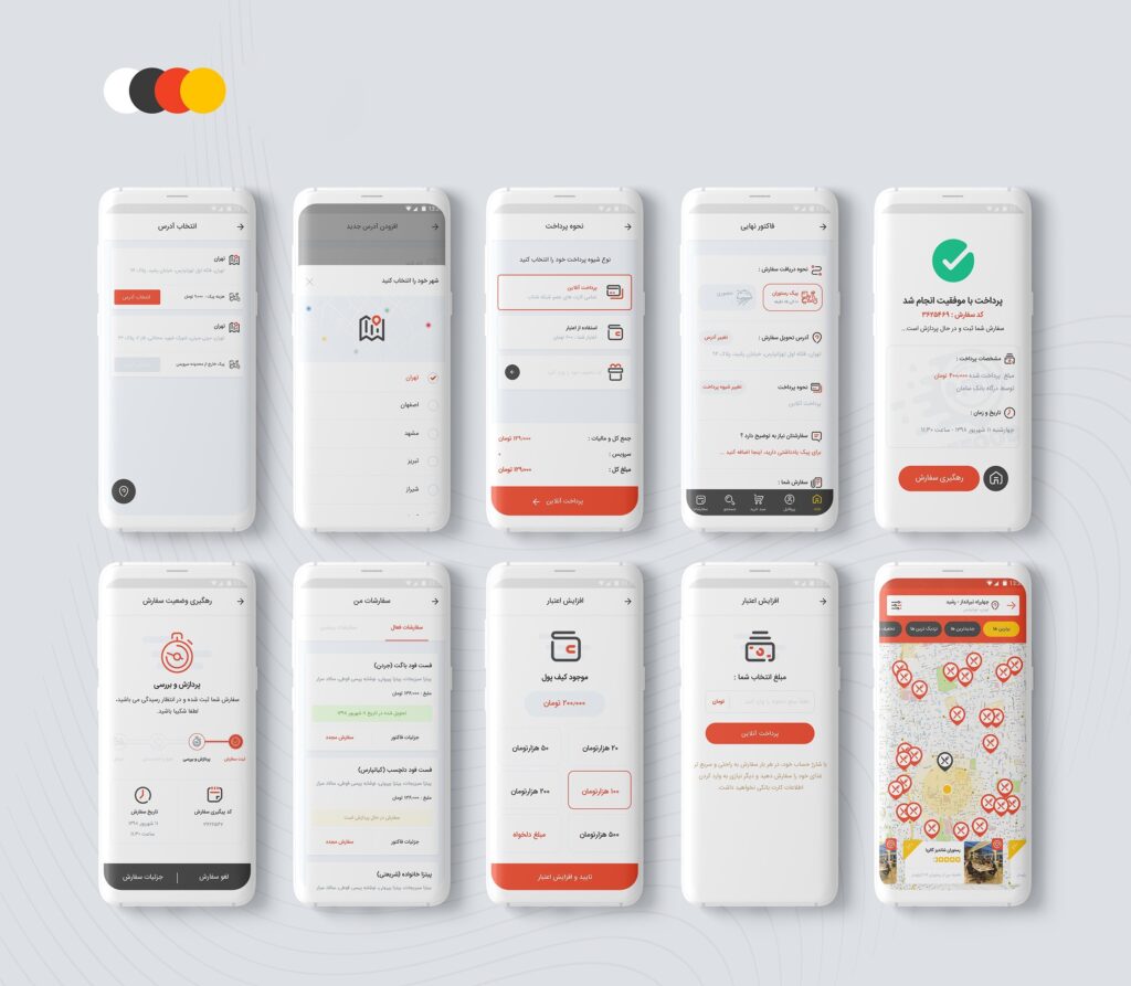
With the initial usability issues fixed, I created mockups and a high-fidelity design prototype.
What is next?
infinite loop of Usability test, Learn, Build.
