To maintain professional intergiry. Some parts of this case study has been censored or replaced with placeholder content.
Intro:
Nonepoket is a platform that allows users to choose the best products to sell from thousands of dropshipping suppliers worldwide.
Problem Statement :
There are no straightforward ways for users to search, sort, filter orders, and track their packages in the Nonepoket’s platform.
Proposed Solution:
we are going to understand users needs and based on that we Transform the search page, filtering and sorting scheme that lets customers find products efficiently better based on their needs.
Primary Question(s)
1- What irrelevant content on the Filter page exist that confused the users?
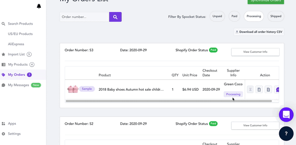
2- What filters should we have on our order page for retailers to quickly narrow down orders they have?
3- Is there a straightforward way for our customers to track their packages? If not, what are those the pain point?
FindingProblems :
UX Research methods
* Moderate Usability
* Eye-Tracking
to avoid artificially forcing the participants to search on the site, this investigation was conducted as a combined navigation and search study. This way, it was up to the participants to choose if they preferred to search or navigate through the categories to find what they were looking for (i.e., they were never asked to use one method over the other). Furthermore, participants were able to mix category navigation and search.
- What type of personas did we select for user research?
We bring four participants whose goals and characteristics (interests, concerns) represent the needs of a larger group of our users. We told them to act as they would on their own, including searching, sorting, filtering product(s), doing or abounding ordering, and sorting results. When experiencing troubles, the test subjects were asked open-ended questions such as:
- What are you thinking right now?,
- Why did you click there?,
- What did you expect would happen?
If the test subjects got stuck entirely, they were not helped at first. If they were still unable to move forward, they were offered support to get past a specific problem were given another task. On such events, it was reported in the research log and counted as a “failed task.” A study was also recorded as failed if participants completely misinterpreted a feature in the search page; for example, if a subject concluded they wanted product “A” because its shipping time & cost is better than product “B” when the opposite was the point.
- Result of Usability test
After four rounds of qualitative usability testing, following the “Think Aloud” protocol, in-person 1:1 moderated usability testing, we found that:
- 100% of participants overlook or ignore the sort button entirely
- 75% of participants ignore Shipping time at first; they would like to jump on the Price section first and go back to shipping time.
- 50% participants do not scroll to the search page because they still believe that the page is still crowded (we need to measure SNR in large group, latter on)
- 75% of participants do not want to click on banners/cards because they are looking for personalized or special offers. (they need dynamic filter based on category)
Eye-Tracking Testing
After conducting the usability test that obeys the “think aloud” framework, We use Tobii eye-tracker hardware to conduct an eye-tracking test study. The eye-tracking test study included 4 new participants with a moderator present during the test sessions (for technical questions), which took 20~25 minutes per participant. The test sessions began by starting the test subjects at a search page and asking them:
- search or find a product from categories!
- You can use the filter and sort option if you would like more pure results.”
We intentionally led the participant to use the filter or sort option. we were looking to understand what features they usually use for sorting and filter products; after that, we asked questions about extra features in filter and sort;
- What option do you like or dislike in the filter section? Why?
- What do you like to use most in the sort section? Why?
- Is there any option you feel must be on the filter and sort section that doesn’t exist now? Why?
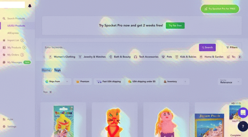
Result of Eye-tracking test study
- 100% of users could not notice the Sort button on the platform as we notice in interviews.
- shortcuts category had been ignored by 75% of users, such as Jewelry & Watches they prefer use search option.
- 100% of the users could not notice that they could remove tags from the filter section, in this case: eyeglass, pants, motorcycle.
- It is exhausting for 100% of the end-user to reopen the filter and change inputs every time to achieve their goal.
- 100% of participants’ attention have been gotten by 2 green bottom, (at first glance) and they found that unless. They would like to find products and latter on use the offers that provided.
- They have suggestion about dynamic filter where they could choose color and size … of a product
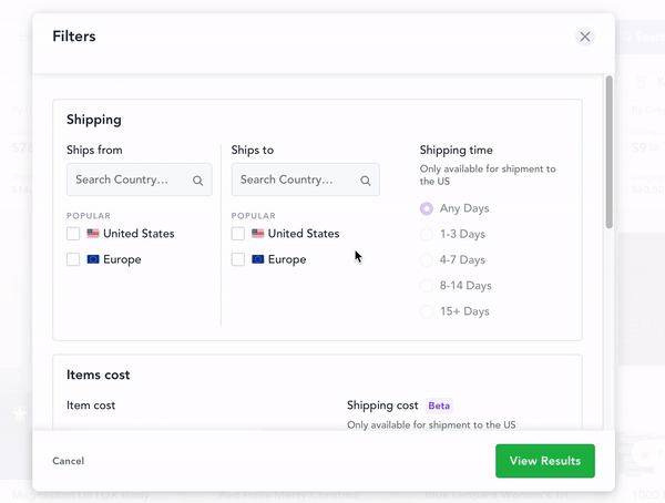
Proposed Solution
New prototype
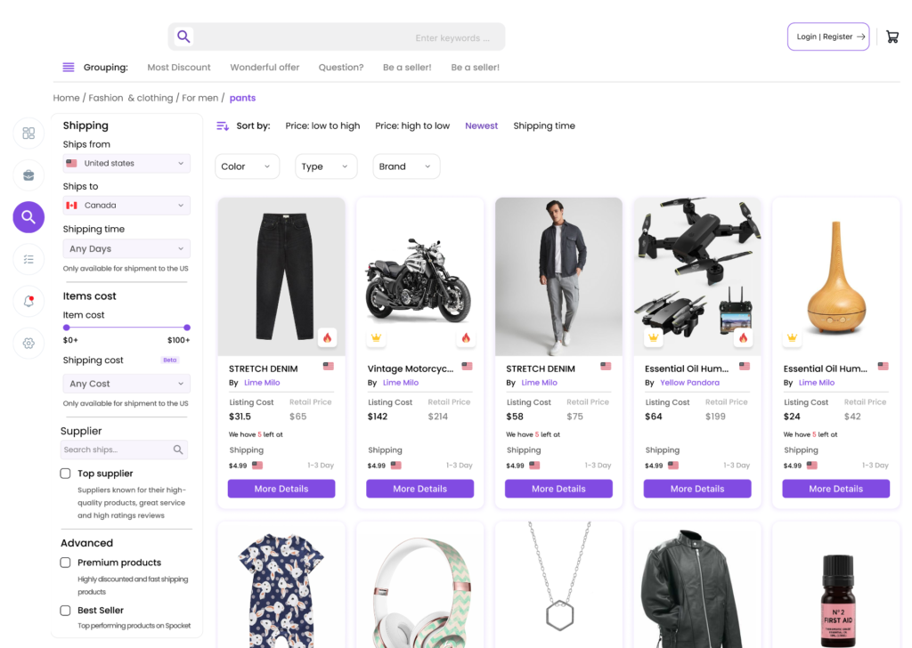
New product definition
- We changed the structure of the search page based on Heatmap results on the one hand, and qualitative data on the other. This new structure was entirely based on the users’ mental model and the results of in-depth interviews with some end-users.
- Before starting the redesign process, we received various feedback from users who were not able to easily interact with the services provided on the search page. By fixing the filter position on the search page, we brought it closer to the users. (Now, faster users can change the filter inputs)
- We also Increase users’ satisfaction when bring the filter section on their left hand.(they don’t have to open and close )
- We have considered a new location and pattern for the sort button, which looks more handy and organized in search page.
- The color system and typography had accessibility issues. For this reason, we changed the contrasts and size of text in the new design.
- The previous typography system was not well-structured for the titles and texts, the visual scan of the components was difficult for the participants, and the content seemed cluttered. based on user’s opinion and our experience we create a more organized user interface and made the textual content of the user interface, such as the text on banners and cards, more readable.
- Faster scroll, means fixed filter, fixed header and fixed sort section on one hand and create detach products layout on another hand increase the agility of participants.
- The new search page follows a new pattern to help users better understand categories.
- In the previous design, the visual components did not have the necessary coordination to achieve integration and coherence(color, shape, boarder, size). All components were modified and synchronized based on the new design system.
- Users should not be forced to register or login before achieving their goals. we bring login and register and basket at top of search page.
constants & goals:
For the new design, We should decide to start implementing the project codes if the test result was positive for more than 75% of participants. If the success rate was between 50% and 75%, we should go back to the design cycle and upgrade the design, and if the success rate was below 50%, we must re-idea to achieve new design examples.
Conduct a test on new prototype
* KPIs
* A/B test
We ran the A/B test based on the null-hypothesis statistical model. Also, during the test we considered the following Key performance indicators for the searching page, to measure the new prototype’s changes effectiveness.
- Time on task,
- The drop of Rate,
- Use of navigation vs. search,
- User error rates
A / B test results:
The test initially showed that 100% of participants could find filter and sort section and easily they changed inputs. The filter had been relocated in this scenario on the left side of the search page. This approach demonstrate that the time on task and drop of rate decreased significantly. 75% of participants preferred to use search options instead of navigation. However, the user error rate increased due to the changes. We must be aware that it will take time for users to adopt themselves with the new design, and this issue will be automatically solved.
Conclusion:
Fortunately, the user success rate in this scenario for 4 participants was 75%, according to usability test results. We suggest redoing the test for at least 50 participants with different characteristics. Nonepoket should release the new design just for 10% of users for two weeks and review the results. If the results were successful, release the new design for 30% of users and recheck the results. Finally, release the new design for 50% of the users, after monitoring all the details with the technology and business team for one month. after all, Nonepoket should decide to release the new design for 100%.
What is the next?
Soon, in another article, we will go into detail about the Nonepoket design system for Google Material Design System and Apple Human Interface Guidelines. And how we align our UI design principles with the Android and iOS Design System principles.